
The color wheel and color theory
In this article, we'll start with learning how to build a color wheel and the roles of primary, secondary, and tertiary colors. After that, we'll continue with hues, saturation, brightness, and some color schemes.
This is an important part of color theory. Understanding the color wheel will help you a lot in your design work. So let's get started.
The main colors of the color wheel.
Let's say you want to create a color wheel. Of course, you'll need some main colors for that. Here's how you're able to do that. Let's start with picking our primary colors.
Primary colors
The primary colors are the building blocks of your color wheel. These colors depend on the color model you use. In this example, we'll use the traditional RYB color model.
As the name suggests, for RYB, we will use red, yellow, and blue as primary colors. Therefore, put these colors equally divided over the color wheel.
Secondary colors
Up next, we have secondary colors. You can put these between the primary colors on the same color wheel. If you mix the primary colors left and right of the secondary color, that's the color you will get.
Here's a list of our secondary colors.
Blue and yellow together make green.
Yellow and red together make orange.
Red and blue together make purple.
Tertiary colors
In most cases, you can even add tertiary colors to your color wheel. We're going for the details now. You can add six tertiary colors by mixing the colors left and right of the tertiary color in question.
Hue, saturation, and brightness
Hue, saturation, and brightness, or HSB, is a popular alternative to the RGB color model. It was created well over 40 years ago by researchers to create a color model that's more similar to how our eyes work.
Hue
If you want to use the HSB color model, start with picking a hue. HSB works on a wheel as well, where every degree is one hue. You have 360 hues to choose from before you're back at the start of the color wheel.
For example, the hue of red is 0. So if you're looking to use red as the foundation of your color scheme, that's the hue you pick. From here on out, you move to saturation and brightness next.
Saturation
Up next is the saturation for the hue you've picked. Saturation is all about the intensity of a color. Low-saturation colors look very washed, like when you put a red and a white shirt in the same laundry. You'll get a very washed pink shirt as a result.
High-saturation colors, on the other hand, are very vibrant. There's little to no grey color mixed with the hue.
You'll notice the above when you change the saturation value to 0, which results in a grey color. However, when you put the saturation all the way up to 100, you'll get a very vibrant in-your-face color.
Brightness
And finally, brightness. It works similarly to saturation and can go on a scale from 0 to 100. When you remove all brightness from a hue, you'll get a black color as a result. On the other end, you'll get a very bright hue mixed with white when you go all the way to full brightness for your hue.
Color schemes
Now that you know what a color wheel is and how to make one, it is time to put theory into practice: we're going to create a color scheme. Let's look at how to do that and include some examples along the way.
How to create a color scheme
Basic color schemes in web and UI design consist of a primary action color, one or two accent colors, a background color, and multiple shades of black and grey for your typography. Of course, you could add more but let's start with the basics first.
If you want to create a color scheme, pick your main color first. In most cases, you have a branding manual or logo in place. These have one or two colors you can pick as a starting point. You'll likely find your primary and accent colors this way.
For your black and grey shades, try to find a color with a very slight hint of your primary color. It'll help bring your colors together once you start designing.
When you're missing specific colors, think of the type of color scheme that you're going for. It'll help you pick the final colors. Here's a list of examples.
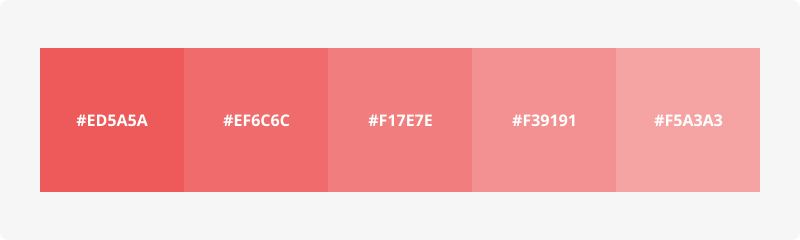
Monochromatic
Monochromatic is probably the safest choice for you to make. It means you use only one color with the addition of tones and shades. For example, does your color scheme only contain shades of green? You're likely using a monochromatic color scheme.
Analogous
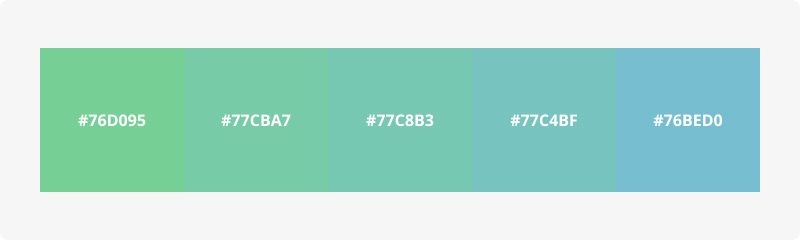
Analogous means that you use colors that are next to each other in the color wheel. It could mean you're using one color, just like the monochromatic color scheme. However, if you're on the edge of one color, it could mean that you're working with a nice gradient from blue to green, for example.
Triadic
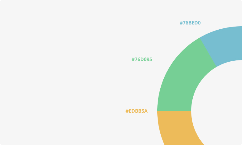
Triadic color schemes use three colors equally distant from each other in the color wheel. Only using primary colors is an example of a triadic color scheme.
You have to be careful with this scheme because of its high contrast. To make sure you're not overdoing it, use one color as the primary action color and the other two colors as accent colors.
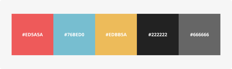
Here's an example.
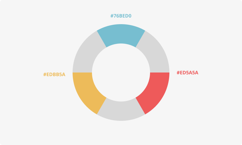
Complementary
Complementary means that you use colors that are opposite of each other. You use complementary color schemes when you need high-contrast colors to highlight certain elements of your product or service.
Be aware when using this color scheme with text. Use it to emphasize a few words, but do not design your entire text this way. It makes your text very hard to read.
Split Complementary
This color scheme uses the complementary color scheme we just discussed as its foundation and adds one more color. Imagine using a complementary color scheme but splitting one of the colors into opposite directions.
Use the colors you land on. For example, if you pick green as your main color, you'll get red and purple as your secondary colors. As a result, you'll lose some contrast, but you'll get more options to work with.
Tetradic
And finally, the tetradic color scheme is a set of four colors. It is one of the hardest schemes to use. It consists of four colors equally distant from each other in the color wheel.
Summary
Using the color wheel is a lot of fun and important for everyone planning to use color theory. In this article, we've talked about the primary and secondary colors found in the RYB color model.
When you use these colors, you can create a lot of color schemes, including complementary colors, monochromatic colors, and many more. Take a look at the examples above to get a better view of what we mean.