In this article, we'll go through some of the most common feelings and emotions caused by the primary and secondary colors on the color wheel. We'll also look at how color associations can depend on culture and branding.
What colors cause what feelings
Let's look at a chart of feelings and emotions for colors first. In this chart, you'll see some of the most common associations we have with our main colors.
| Color | Positive associations | Negative associations |
|---|---|---|
| Red | Love, passion, and emotion | Danger |
| Blue | Sky, water, calmness | Corporations |
| Yellow | Warmth, energy, joy | Envy |
| Green | Grass, flowers, trees | Money and institutions |
| Orange | Bright, high-energy | Arrogance |
| Purple | Magic and strength | Expensiveness |
Next, here's a more in-depth look at each color from the chart. After that, we'll look at other factors that influence what feelings are caused by what colors.
Red
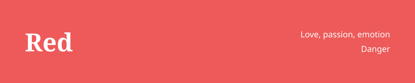
As mentioned in the chart, red is the color of passion, emotion, and love. Just think of the red hearts, roses, and Valentine's Day. On the other end, it is also the color of danger, as you can see in traffic lights, stop signs, and error messages.
Red can cause positive and negative emotions. Because of this, it is a risky color to pick for your color schemes.
Yellow

Yellow is the color of the sun. It symbolizes warmth, energy, and electricity and can cause feelings of joy.
In addition, it is the color the human eye sees first. That's useful to know when you're designing with e-commerce and CRO in mind.
Blue

Blue is the color of the sea and sky. It's very calm and open. Since blue doesn't have a lot of negative color associations, it is a very safe color to pick for color schemes and logo design. That's why many corporations use blue as a logo color.
It is also the most popular favorite color in the world. Yet another reason why it is a good choice for a logo.
Green
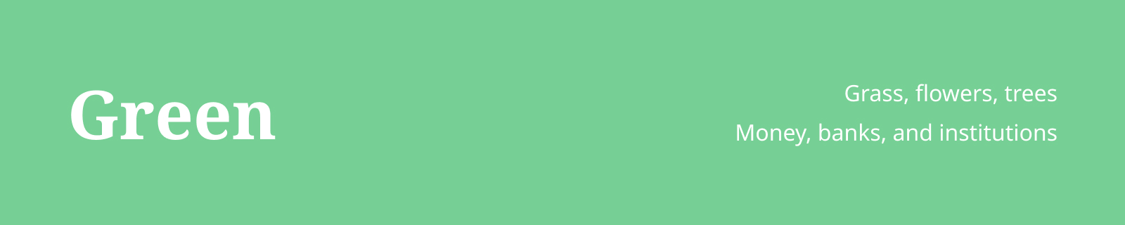
Let's move to secondary colors. Up next, we have green. Green is a mixture of blue and yellow. It's the color of nature, grass, flowers, and trees.
Green also gets associated with money, banks, and institutions, which can cause both negative and positive emotions depending on who you ask.
Orange
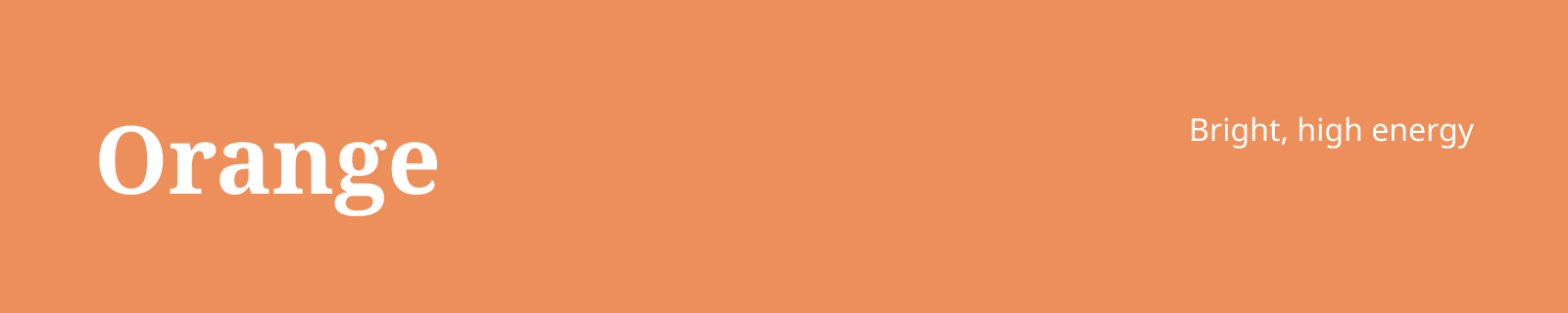
Orange is a mixture of yellow and red. Unlike some secondary and tertiary colors, it does have the same associations and feelings as its parent colors.
It's a very bright, high-energy color, which usually causes positive feelings. In e-commerce, it is a popular color for call-to-action elements because of how quickly our eyes spot orange.
Purple

And finally, that leaves us with purple. The color purple, which you can obtain by mixing blue and red, is a color that's usually associated with calmness. It is similar to blue in that way.
Unlike blue, purple can trigger more adventurous feelings and emotions, too. Purple is the color of magic and strength. It is also a common color for flowers.
The influence of culture on color associations
Let's take a closer look at the influence of culture on the feelings caused by colors. Some interesting examples include white, red, and green.
In Western culture, the color white is associated with peace and weddings, while in some Eastern cultures, the color white is associated with death.
In Germany, red is the color of bad luck, while in China and a few other countries, it is the color of luck.
Green is associated with disease in some African countries, while it stands for love and happiness in Japan.
If you look at the feelings caused by certain colors in different countries, you'll see that these associations couldn't be further apart.
It teaches us that it's very important to do user research before blindly picking a color for your design work.
The influence of branding on color associations
Branding plays a massive role in our associations and feelings with colors. For example, the red and yellow of McDonald's and the red of Coca-Cola cause positive feelings for most people and are associated with having a good time with family and friends.
These associations are very different compared to the feelings caused by the red of corporations like Adobe and Canon.
It shows us that the feelings and emotions caused by colors depend on more than just the color itself. Context, branding, and culture play a significant role as well.
So, when you design something, don't just pick a color based on color theory basics. Also, think about your target audience.
Look at your competition, what colors they use, and see what feelings these colors cause. Here's what to do depending on the outcome.
If the outcome is not what you want, pick a different color.
If the color associations match your desired outcome, you can use your competitor's colors as a starting point.
The main takeaways for designers
In this article, we went through several examples of color associations and feelings per color in different settings.
Here's a list of the main takeaways and actions you can apply as a designer to make sure you pick the right colors for your audience.
The first one is that you should always look at the context of your project before picking a color. Ask yourself these questions.
What is your client associated with?
What feelings are caused by the colors they're already using?
It's very important to consider these questions before blindly picking a color. If you don't, you're in danger of choosing colors that don't resonate with your audience. That's a huge business risk!
And secondly, culture plays a very big role in color associations. One color can cause different feelings based on who you ask in which country.
To prevent a branding blunder, make sure you do your research before you just pick a color. It's important!
And that's it. With the tips above in mind, you'll be able to pick the right color for your projects.